Center for Community and Business Research Institute for Economic Development University of Texas at San Antonio
- Region L and the Need for Population Projection Analysis
- Study Points
- General Information about the Population Projection Study
- Graphics
- Static and Dynamic Maps
- About the Center for Community & Business Research
Click Here for the Region L Population Projection Executive Summary
Click Here for the Region L Population Projection Study
Click Here for the Region L Population Projection Appendix
Click Here for the Region L Population Projection PowerPoint
Click here for the Region L Population Projection Dynamic Maps based on Labor Force
Click here for the Region L Population Projection Dynamic Maps based on School Enrollment
Click Here for the Region L website: www.RegionLTexas.org
Summary Article prepared by Dr. S. Roberts, Research Economist, Center for Community and Business Research
Maps prepared by Hisham Eid, GIS Specialist, Center for Community and Business Research
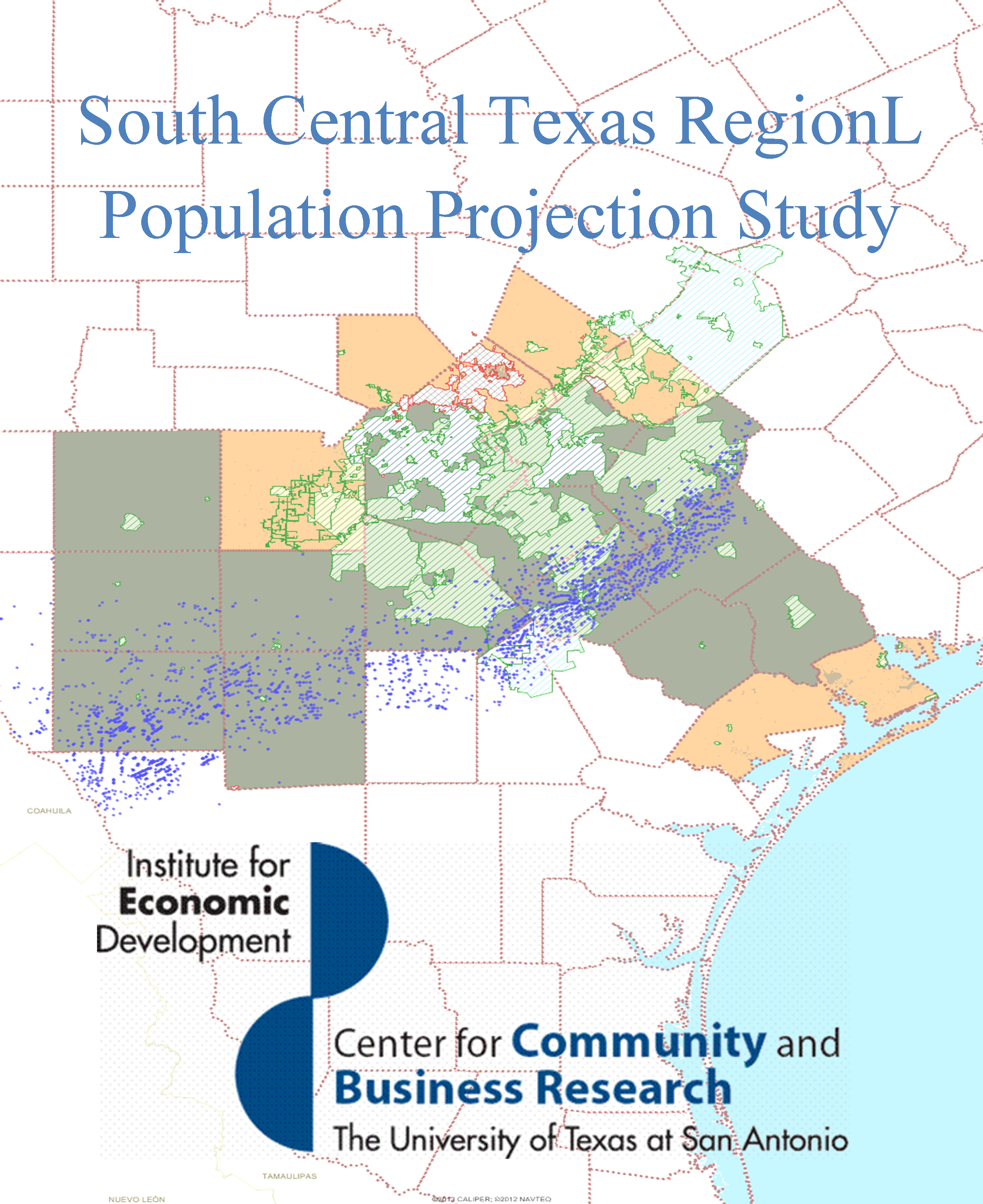
The South Central Texas Region L Water District consists of 21 counties that include Atascosa, Bexar, Caldwell, Calhoun, Comal, DeWitt, Dimmit, Frio, Goliad, Gonzales, Guadalupe, Hays (southern half), Karnes, Kendall, La Salle, Medina, Refugio, Uvalde, Victoria, Wilson and Zavala. These counties are outlined in the map below.

With the Austin corridor to the north, Houston shipping and trade area to the east, coastal areas to the south east, and border with Mexico to the south west, Region L reflects a large portion of the state with opportunities for development. Following the immense growth of the Dallas-Fort Worth region, and despite the economic downturn that has gripped the nation over the past few years, Region L has the potential to become the next gateway to expansion of transportation, financial, resource , employment and industrial growth for Texas, spurred by massive investment in Eagle Ford Shale.
- Discussing the parameters of population projections and their implications;
- Illustrating how the information in the study can be used for Region L report use;
- Discussion on methodology information to help Region L members understand choices and judgments related to population projection data, analysis and inferences;
- Identifying adjustment criteria and documentation for the review process and supplying information for those criteria and documentation factors;
- Providing evidence and support for possible requests concerning population recounts from the U.S. Census;
- Providing support for significant and substantial rate differences in population changes in Region L, along with circumstantial activities and processes that may be affecting population change;
- Providing support for various scenario choices provided by the State Demographer’s population projections;
- Discussing methodology related to the State Demographer population projections that may render them a second choice or not appropriate, rather than a first choice for Region L situations;*
- Discussing methodology related to the data collection and analysis used in this study;
- Discussing data sources that can be instituted and followed up at local levels to record and track data related to population changes for future use;
- Discussion on how to read and assess results and comparisons for informed use of the study in current and future comparative analysis.
The study discusses basic demographic theory as well as various methodologies used for population transition phases in general and for this region, and offers a range of population projection statistics and graphics for comparison by Region L members.
The Texas State Data Center’s Office of the State Demographer has posted three population projection scenarios, calculated with a standard B/D/M formula called a “cohort component” method. This method uses birth (B), death (D) and in- out- migration (M) rates to project a population over time. Inmigration and outmigration refers to movement of members of a population into or out of a specific area. Birth rates may reflect fertility age and numbers of births, while mortality can reflect longevity, disease and access to life-supporting resources. The formulas reflect life patterns of fertility, mortality and movement activities by location over time that can result in change or lack of change pre or post transition, growth, stagnation or decline of population rates across long periods of time. Three scenarios are calculated by the State Demographer’s Office: 0.0, which reflects a normal or stable projection scenario of the B/D/M formula, 0.5, which reflects a conservative projection scenario, and 1.0, which reflects an aggressive projection scenario. It is important to understand that the “conservative” and “aggressive” scenarios may result in counterintuitive projection targets. If a county has a historic trend of losing population over time, a conservative scenario may show a projection with less population loss; while a county with a historic trend of high growth population over time may show slower population gain with a conservative scenario, for example. The aggressive scenario, likewise, for a county that has experienced loss over time may show less population projected in 40 years than currently exists, which is highly unlikely; while a county that has experienced rapid growth may show extremely high population projected in 40 years, which may not be realistic.
In addition to the B/D/M formula, other methods for projecting populations are possible. These use a characteristic of a segment of a population with a multiplier. Triangulation of several calculations is recommended, as many times data may not be available or reflective of a local situation. This study has analyzed the Eagle Ford Shale (EFS) context, 2010 U.S. Census data, three additional alternative data sets (labor force: EMP, school enrollment: SE, and housing-unit-related: HU-BP), calculated additional stepwise-autoregressive population projections from those alternative data sets using calculated persons per household multipliers (PHH) related to those alternative data sets. It also investigated the assumptions and methodology of the B/D/M formula and U.S. Census enumeration (methods information is available at the State Data Center and U.S. Census websites). In all, the study looked at and compared six population projections: three from the Texas State Data Center (TSDC) and three from alternative data; and three different methodologies: the U.S. Census enumeration method, the B/D/M population formula method, and the results from the stepwise-autoregressive method. By using different methods to develop population projections, this study has given planners a set of cross-validated projections for a more robust picture of future water needs concerning residential population of the area.
Data utilized by the Center for Community and Business Research (CCBR) for this study is publicly available and was acquired through internet, printed format, and freedom of information (FOI) requests where necessary. In order to reflect recognized methodology and take into account known issues in demographic assessments, citations from the State Demographer, U.S. Census methodology, and other researchers specializing in population projection and extraction industry impacts were used in the study.
The CCBR respects and honors the population projections published by the Office of the State Demographer and sought counsel from the State Demographer in the preparation of this study. Likewise, the CCBR has sought to make the process as transparent as possible for understanding and to enable replication, where desired, by those who will use this study for policy-making purposes.
It is important to note that the B/D/M formula is not faulty, and the other data-set analysis is not “better”, but due to associations with U.S. Census counts, different number ranges are to be expected. What this report shows is that there are several counties in Region L that have evidence to support a request for population recounts from the U.S. Census and to support asking for and justifying alternative population data in review documents that will be submitted to the TWDB for the 2013 planning cycle.
Significant and substantial rate differences are seen by the findings in this report, which are justifiable reasons for population number adjustment, according to TWDB documentation. This report has also identified areas where local governance may be helpful in tracking changes through tracking systems and records accessibility so that future need of substantiating numbers can be more efficient and available to planners. Water is just one aspect of the impacts being felt by Region L counties in relation to the Eagle Ford Shale activities. As the extraction industry continues to impact the area, streamlined and improved information for planning will be paramount.
The graph below shows the Historic population counts as reported by the U.S. Census, 1990-2010. Bexar County is not included so that the relative rates for the other Region L counties can be seen.

The table below compiles and lists the 2050 projection numbers from the State Demographer scenarios, the historic and event projections for employment and school enrollment, and the housing statistic projections. Cells in color reflect results from alternative data. Cells in yellow show values that are lower than those of the group of scenarios; those in green show values that are not different and fall within the State Demographer scenario group range for 2050 population; the red cells show values that are substantially higher than those of the scenario group.


When looking at the EMP-, SE- and HU-based forecast graphs and charts, sudden rate changes can be seen as a bubble, or as a wide variation between two charted data types. For example, downward SE in percent change would be expected if there was a much larger influx of single or family-less people moving into that area. EFS workers fit that description. The bar chart below shows differences between Labor Force and Population Counts.

The study has included graphs such as the one below of the State Demographer Scenarios that are based off of the B/D/M cohort component formula, the normal scenario “0” as blue, the conservative scenario “.5” as red and the aggressive scenario “1” as green.

Forecast output showing projection and confidence intervals for each alternative data set for each county is also included in the report appendix, showing historic and event graphics for comparison of confidence intervals and target ranges. An example is shown below.

It is important to note that the population projections used by this study for comparison are the 2010-2050 scenario sets that were available at the instigation of this study, and not the updated recently released versions that have been average-trended out to 2060 or 2070 from the State Demographer’s 2050 projection scenario rates, not based from the B/D/M formula used for the 2010 to 2050 time period. However, the same comparison principles discussed for the original TSDC sets and this study’s sets hold and can be used when comparing this study’s results with other newer sets.
Static and Dynamic Maps
Region L Population Change Maps for Pre- and Post- Eagle Ford Shale activity event periods, based on U.S. Census data
In the following static and dynamic maps, the percent change for the historical or event periods are shown. That is, from a base number in the starting year to the change number in the ending year, the percent of change has been calculated and mapped by color. Loss is shown by range of one color and gain by range of another color. Comparing the maps can help in understanding differences in data sources as well as base periods used.
These two maps illustrate historic change and the changes from 2008-2012, during the Eagle Ford Shale event period. This illustrates the reversal of out-migration in several of the Region L counties, and an influx of population to the Region L area. Yellow is percent change decrease, purple is percent change increase.


Findings: Mapped percent change differences between Census-Counted Population and Labor Force-Based Population, 2000-2012
De Witt, Dimmit, Goliad, Gonzales, La Salle, Refugio, and Victoria Counties all saw substantial differences in population projection target numbers based on employment for the historical period versus the State Demographer projection scenarios. Bexar, Calhoun, De Witt, Dimmit, Frio, Goliad, Gonzales, Karnes, La Salle, Refugio, Uvalde, Victoria, and Zavala Counties all saw substantial differences in population projection target numbers based employment for the event period versus the State Demographer projection scenarios.
Differences are very apparent in the map below, which shows the difference between population increase and employment increase. Purple shows more population officially counted than employment reported and green shows more employment reported than population officially counted. Dimmit, at the darkest green shows a vast difference in the percentage of the number of people reported working than of the number of officially counted population. Comal, on the other hand, shows a vast difference in the percentage of the number of officially counted population than of the number of people reported working. Bexar, Wilson, Guadalupe and Gonzales show reported employment and officially counted population with little percent differences, which would be expected if there was alignment between reported employment and officially counted population. Vivid color change points to the need for recount and a review of population data for that county.


Findings: Mapped percent change differences between Census-Counted Population and School Enrollment-Based Population, 2000-2012
The findings for population projections, based on School Enrollment relative to the event period, are of substantially higher differences for De Witt, Gonzales and Victoria counties.
Differences are very apparent in the map below, which shows the difference between population increase and school enrollment increase. Purple shows more population officially counted than school enrollment reported and green shows more school enrollment reported than population officially counted. Gonzales, at the darkest green shows a vast difference in the percentage of the number of children reported in public school than of the number of officially counted population. Kendall, on the other hand, shows a vast difference in the percentage of the number of officially counted population than of the number of children reported in public school. Bexar shows reported school enrollment and officially counted population with little percent differences, which would be expected if there was alignment between reported school enrollment and officially counted population. Vivid color change points to the need for recount and a review of population data for that county.


About the Center for Community & Business Research
The Center for Community and Business Research (CCBR) is one of ten centers within the University of Texas at San Antonio’s Institute for Economic Development. Each center is specifically designed to address different economic, community, and small to medium sized business development needs. CCBR conducts regional evaluation, assessment, and long-term applied research on issues related to community and business development.
CCBR serves the needs of economic development agencies, workforce development boards, businesses, associations, city, state and federal governments and other community stakeholders in search of information to make better informed decisions.
CCBR develops, conducts, and reports on research projects that shed light on how organizations, communities, or the economy work. This is done through the use of various techniques including, but not limited to:
- Economic impact analyses
- Feasibility studies
- Surveys of business and community organizations
- Community Development studies
- Transportation studies
- EB-5 Regional Center studies
- Analysis of secondary data
- Report writing and presentation
For more information about CCBR or the Institute for Economic Development, please contact (210) 458-2020.
The mission of the Institute for Economic Development is to provide ongoing consulting, training, technical, research and information services in tandem with University-based assets and resources and other state, federal and local agencies, to facilitate economic, community and business development throughout South Texas and the Border Region.
Working together to build the economy one business at a time.